
Client
Tetra Pak
Year
2025
Category
Branding, Graphic Design, Art Direction
Team
Creative Direction: Krystal Liau, Eunice Yeo
Art Direction: Roxann Gan
Graphic Design: Roxann Gan, Farida, Maggie, Melina
Tetra Pak, a global leader in food processing and packaging, runs a programme called the co-creation journey. It is a workshop experience hosted at their Customer Innovation Centre, where they collaborate with clients to develop ready-to-drink food and beverage solutions.
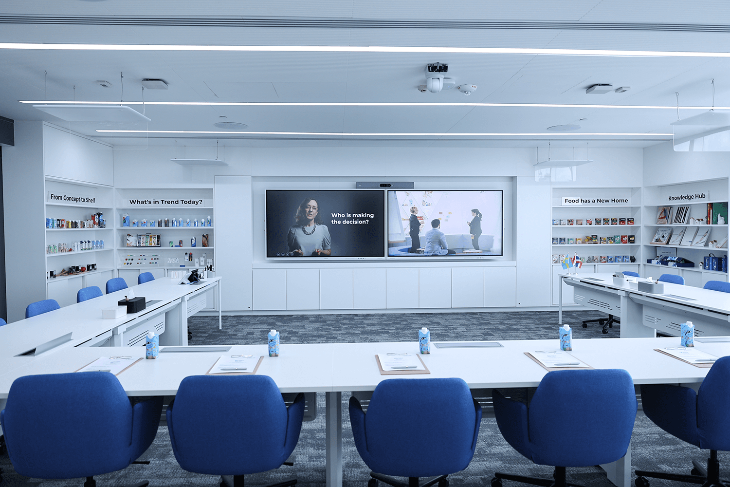
Tetra Pak was looking to launch a new workshop focused on the emerging Food Supplement & Nutrition (FS&N) category. They needed a brand and visual identity to represent it, similar to how their other workshops each have their own distinct identity.

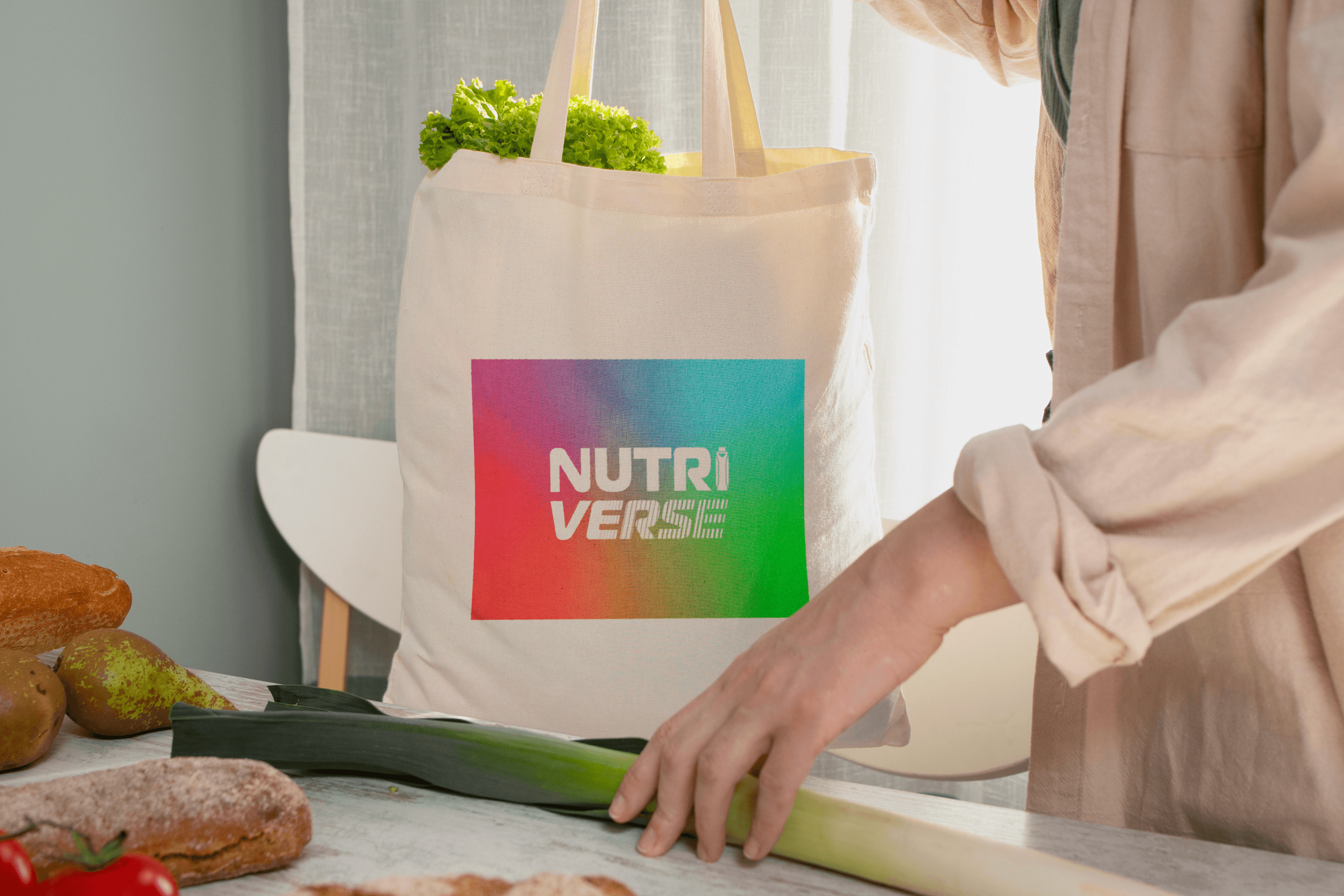
That led to the creation of Nutriverse
Nutriverse (Nutrition + Universe) represents the vast possibilities and opportunities within the world of nutrition. It was created as a flexible and forward-looking brand platform for all of Tetra Pak’s FS&N co-creation journeys.
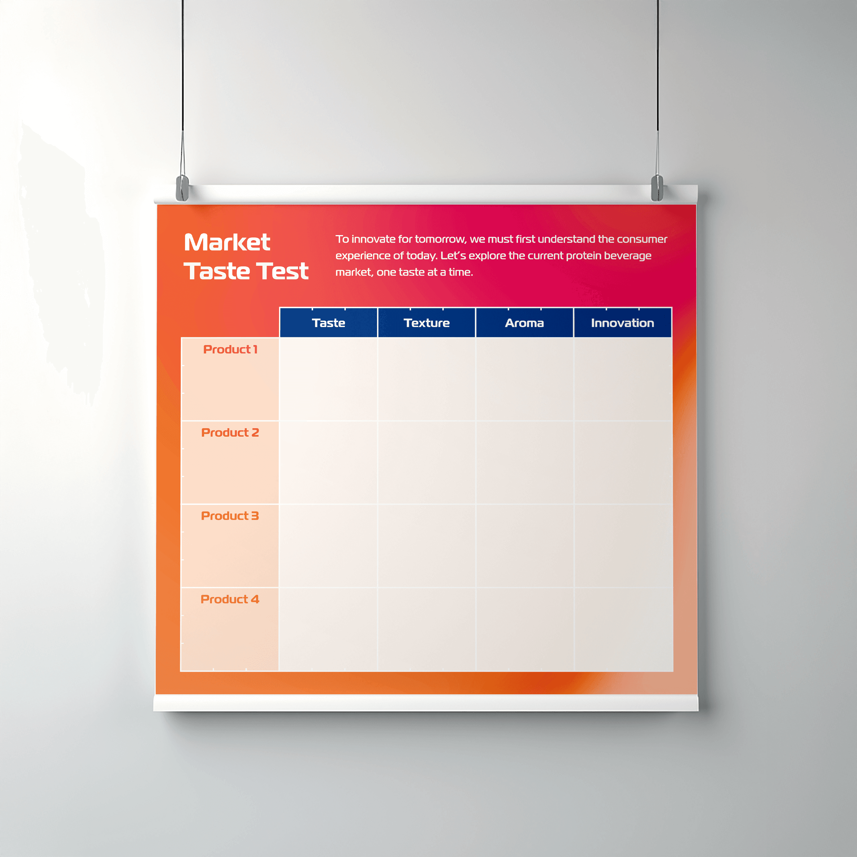
We developed the brand system along with its first edition, Protein Up, which supports clients exploring ready-to-drink protein products.
Together with Krystal, we were involved in the creative and art direction and oversaw a team of designers to ensure consistency and quality across all materials, from presentation slides to workshop touchpoints.
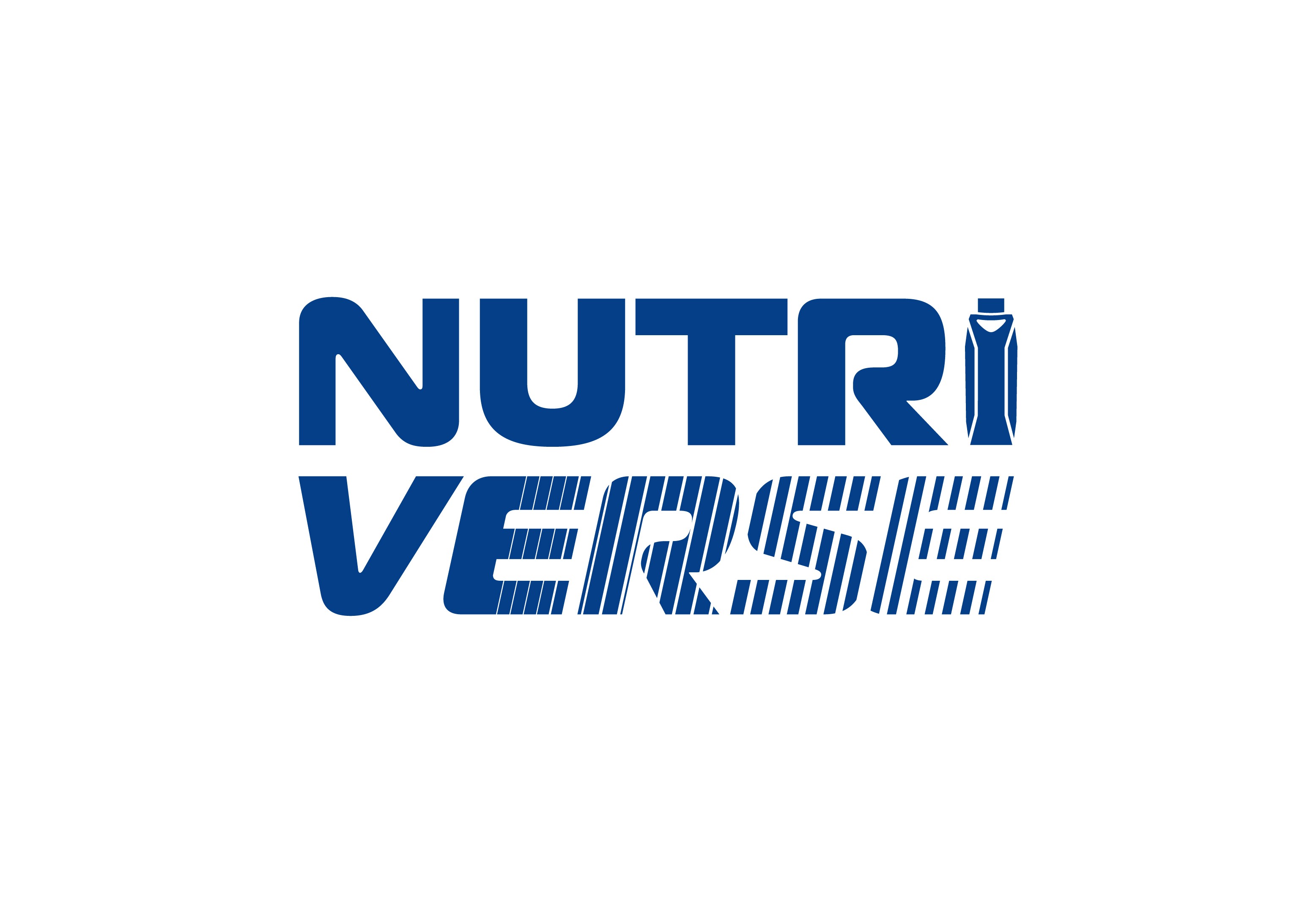
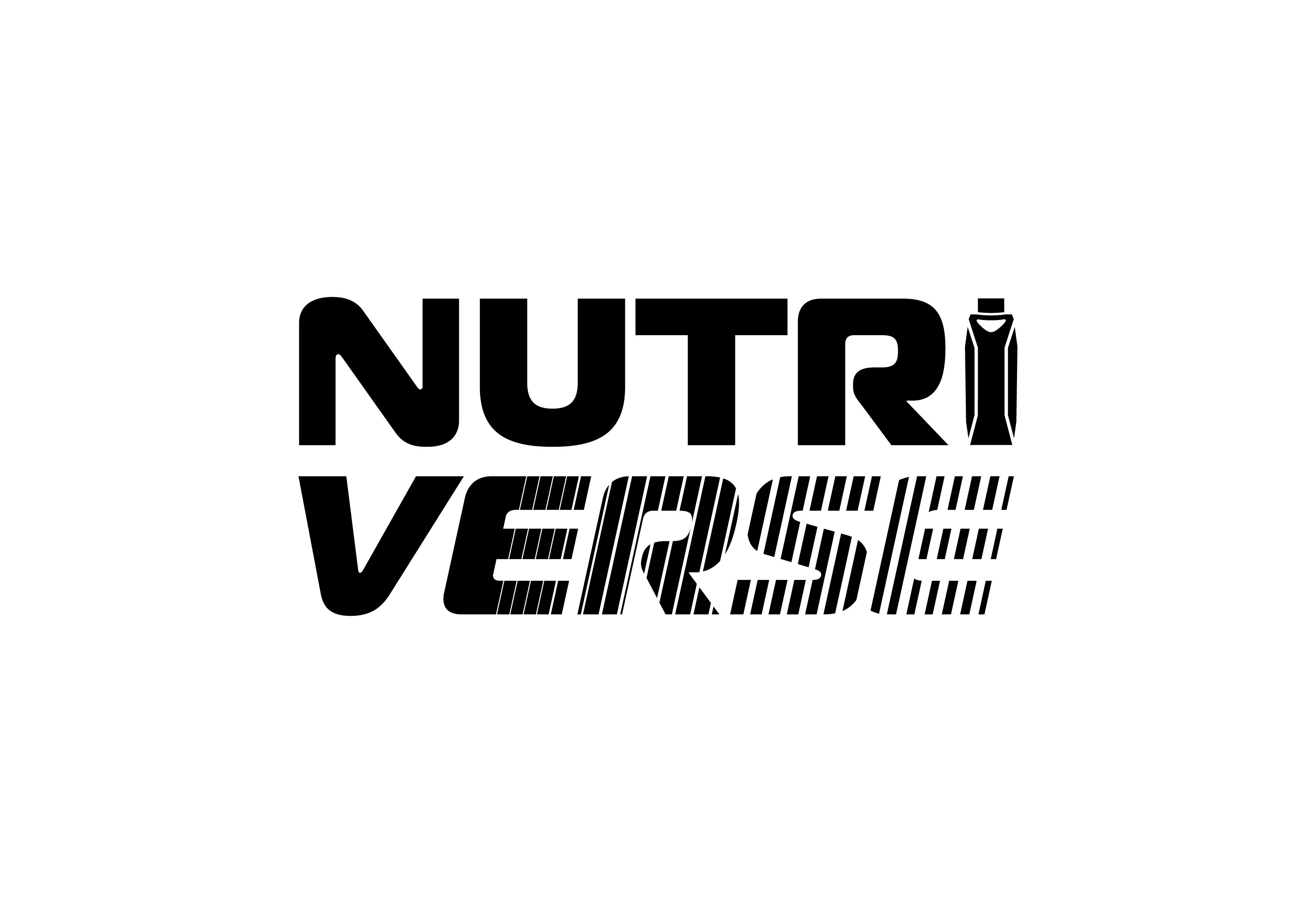
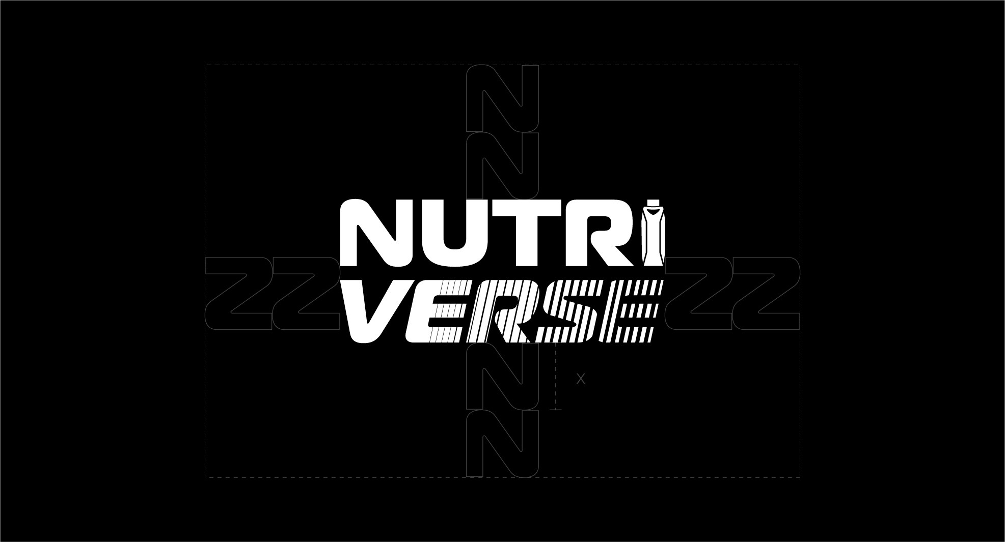
A logo that captures the breadth of innovation in nutrition
The Nutriverse logo was designed to reflect the broad range of nutrients, ideas, and possibilities within the Food Supplement & Nutrition (FS&N) category.
The white logotype represents openness to learning and new ideas.
A striped treatment in the word “VERSE” adds a sense of motion, reinforcing the idea of continuous development within the FS&N category.

x
Putting the Pack in the Wordmark
As this co-creation workshop focuses on ready-to-drink products, the letter “I” in Nutriverse was designed with a Tetra Pak package silhouette to reinforce that focus within the brand identity.

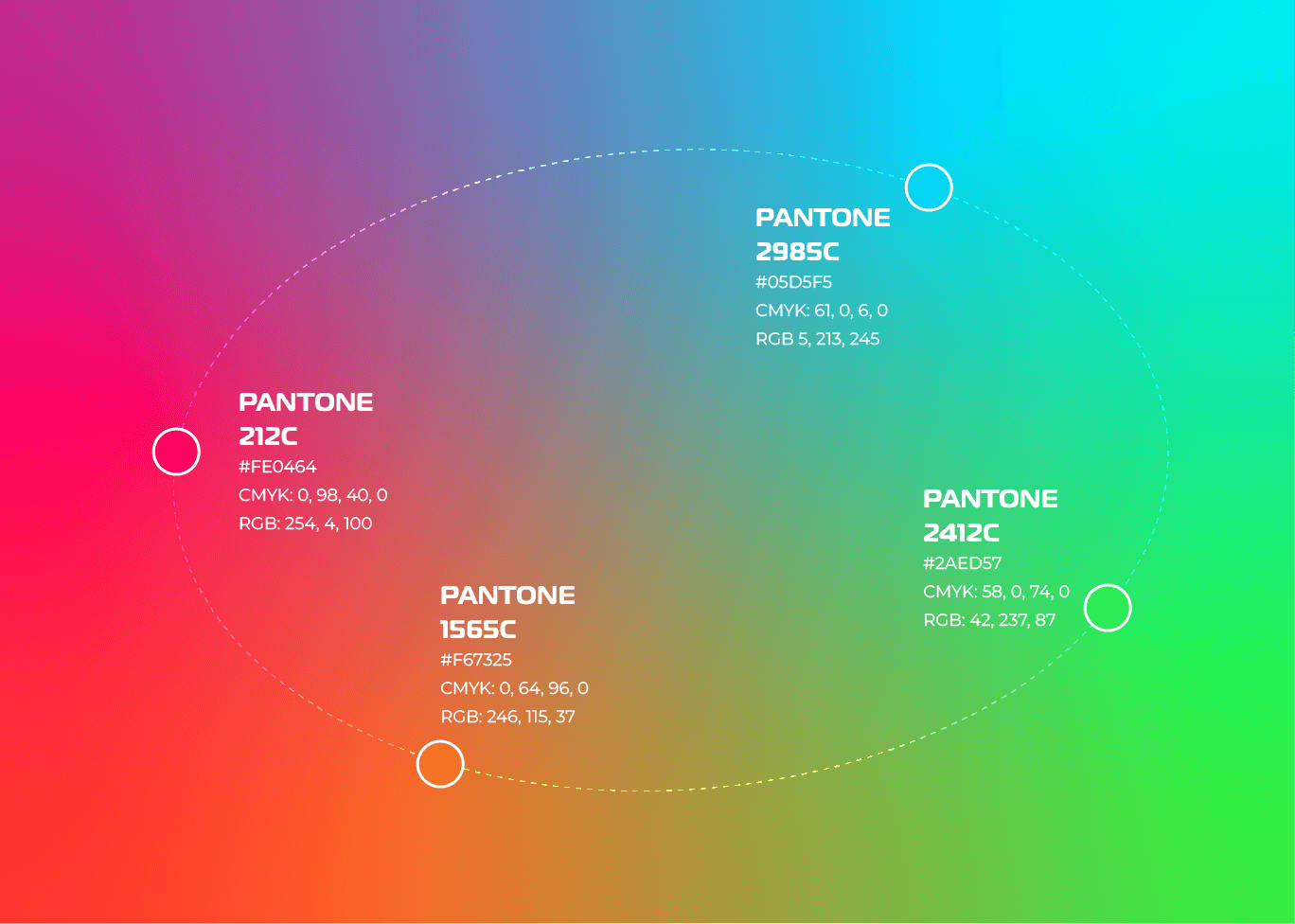
The Core of the Nutriverse Visual System
The Nutriverse gradient is a blend of four primary colours and serves as the core expression of the brand’s energy and diversity. It also functions as a unifying visual foundation. It ensures that all current and future editions under the Nutriverse umbrella remain connected to a single, recognisable brand universe, even as each edition develops its own distinct identity.
With Nutriverse established as the overarching visual system, the next step was to translate it into a focused identity for its first workshop, centred on protein.
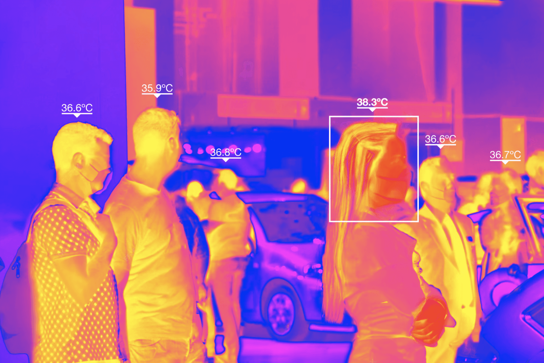

Inspired by the colourful gradients found in thermal scans, we saw a strong visual connection to the foundation of Nutriverse.
The energetic colour shifts reflect vitality and movement, qualities closely associated with protein and physical performance.

Molecule-inspired elements were introduced to reflect nutrition research and formulation.
Together, these elements shape the visual identity of Nutriverse’s first Enabler Edition, Protein Up.
It keeps it connected to Nutriverse while giving it a distinct character. The colour palette was refined to use only colours from the Nutriverse gradient. The hot pink and orange tones were chosen to reflect the energy and performance associated with protein.

Visual Identity Guidelines for Brand Continuity
To ensure the Nutriverse brand maintains a strong and cohesive identity across all platforms and touchpoints as it grows, consistency in brand language is essential.
We delivered a comprehensive brand guideline to support both internal and external teams, providing clear direction on the visual system and serving as a reference for future applications.
The visual language carries through the identity, incorporating molecule graphics and human figures treated with heatmap effects. Thermal scan-inspired elements such as crosshairs and temperature scales were also integrated to reinforce the themes of energy, performance, and scientific precision.


Future Edition Logo Guideline
As Tetra Pak anticipates more editions in the future, such as Immunity or Fibre, we established a design rule to guide them on the creation of future edition logos to ensure a clear and consistent visual link across the entire system.
While the logotype and placement remains the same, each edition will be differentiated through its background treatment. For instance, an Immunity edition might use metallic or foil textures to suggest strength and protection. Despite their unique styles, all editions will draw from the Nutriverse gradient, maintaining a cohesive and recognisable brand system.
